Thursday, 2 December 2010
How the BBC sexed up statistics
As has been noted here and here the Beeb has a new series out on statistics. Yes you read that correctly. OK we are talking BBC 4 here rather than prime time BBC 1 but still respect to the BBC for taking on a hard subject and as you can see from the video above making great television. Hopefully the rest of the programme which is out on Tuesday 9pm will be as good.
Sunday, 28 November 2010
Cluster Analysis
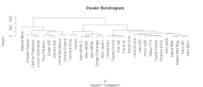
Cluster Analysis has been around for a few decades and uses a range of mathematical formula to categorise data into smaller groups or "clusters" which enable researchers to discover relationships. That sounds complex but thankfully computers do all the legwork and it can be a great form of exploratory data analysis with good data visualisation potential. R Tutor has a great tutorial. Here is the code.
> d <- dist(as.matrix(mtcars))
> hc <-hclust(d)
> plot(hc)
Yes that's it!
Saturday, 27 November 2010
The Edinburgh Edition
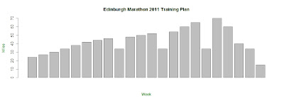 This is my wildly optimistic training plan for next years Edinburgh Marathon. R good for plotting high weekly mileages; not so good for actually doing 20 mile training jogs but it's only a programming language. Speaking of which here is the code.
> jog <-c(24,27,30,34,38,42,44,46,34,48,50,52,34,54,60,65,34,70,60,40,34,15)
> barplot(jog,ylab="Miles", xlab="Week")
> title(xlab= "Week", col.lab=rgb(0,0.5,0))
> title(ylab= "Miles", col.lab=rgb(0,0.5,0))
> title(main="Edinburgh Marathon 2011 Training Plan",)
Tuesday, 23 November 2010
Crime data brought to you by R
Like Andy Cotgreave I have been inspired by this Flowingdata tutorial. Why not have a go yourself?
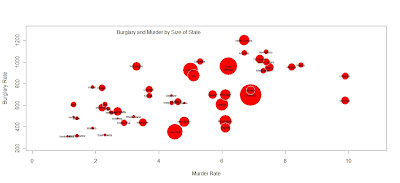
All it took was a few lines of code.

All it took was a few lines of code.
crime <- read.csv("http://datasets.flowingdata.com/crimeRatesByState2008.csv",header=TRUE, sep="\t")
symbols(crime$murder, crime$burglary, circles=crime$population)
radius <- sqrt ( crime$population/ pi )
symbols(crime$murder, crime$burglary, circles=radius, inches=0.35, fg="white", bg="red" , xlab="Murder Rate", ylab="Burglary Rate")
text(4,1275,"Burglary and Murder by Size of State")
text(crime$murder, crime$burglary, crime$state, cex=0.5)
Friday, 15 October 2010
Not on TV
Possibly the smartest, coolest and beautiful video you will see on the changing nature of information in the digital age.
Thursday, 14 October 2010
The Normal Distribution
Tuesday, 6 July 2010
Levels of Measurement
The seminal paper that first set out levels of measurement was "On the theory of scales of measurement" by S.S. Stevens (1946) you can download a copy from here. He argues that all measurements have to fit one of his four levels of measurement, nominal, ordinal, interval or ratio. They can also be characterised more broadly into Categorical and Continuous
Categorical variables
These are variables that come in categories
- Nominal: Determination of equality. More than 2 categories in no particular order eg. Types of transport bicycle, car, train
- Binary: Data in only 2 categories eg. Pregnancy, pregnant or not pregnant
- Ordinal: Determination of greater or less. More than 2 categories with logical order eg. Social class A,B,C1,C2,D,E
Continuous
This are numerical variables.
- Interval, Determination of equality of intervals or differences. It is like an ordinal variable in that it is ranked but additionally it is a measurement where the difference between two values is meaningful. An example would be temperature in degrees Celsius
- Ratio, Determination of equality of ratios. Must be ranked like ordinal, like interval the difference must be meaningful but also there must be a non arbitrary absolute zero and have a ratio so that you can multiply and divide the data. In social research most "count" variables are ratio, for example, the number of sales in the past month. Why? Because you can have zero customers and because it is meaningful to say that "we had twice as many customers in the past month as we did in the previous month."
- Discrete variables uses whole numbers. A variable can be continuous and discrete or just continuous.
What type of measurement used effects the the type of statical analysis that should be used on the data. Nominal is the least statistically useful then ordinal and interval. Finally ratio is the most useful for doing analysis on.
Wednesday, 24 February 2010
First Syntax
COMPUTE LabVot9209 =LabPoll09-LabVote92.
EXECUTE.
This article on the Ipsos Mori website by Dr Roger Mortimore has data from polls conducted during the 1992 general election and in 2009. On the right of the data there is a variable of Conservative vote change 92-09 but there is no Labour equivalent so I thought I would have a go at that. Turns out it was rather easy in the end. So easy I had time to make a nice graph as well.
 If the graph is a little too small to see here on blogger click on the picture and it should expand to a much more reasonable size.
EXECUTE.
This article on the Ipsos Mori website by Dr Roger Mortimore has data from polls conducted during the 1992 general election and in 2009. On the right of the data there is a variable of Conservative vote change 92-09 but there is no Labour equivalent so I thought I would have a go at that. Turns out it was rather easy in the end. So easy I had time to make a nice graph as well.
 If the graph is a little too small to see here on blogger click on the picture and it should expand to a much more reasonable size.
Monday, 22 February 2010
How to report results properly
Reporting Statistics in APA Format
Cronbach's Alphas
Values to report: the number of items that make up the subscale, and the associated Cronbach's alpha.
Examples
The extraversion subscale consisted of 8 items (a = .66), the agreeableness subscale consisted of 6 items (a = .70), and the neuroticism subscale consisted of 7 items (a =.52). Cronbach's alphas for the 12 academic and 13 social self-efficacy items were .80 and .68, respectively. The stress inventory was found to be highly reliable (20 items; a = .86).
Correlations
Values to report: correlation (r) and significance level (p).
Examples
Self-efficacy and grade-point average were significantly correlated, r = .54, p < .05. There was a nonsignificant correlation of .08 (p = n.s) between self-efficacy and gradepoint average. Regression Values to report: R2, F value (F), degrees of freedom (numerator, denominator; in parentheses separated by a comma next to F), and significance level (p), Beta. Report the Beta and the corresponding t-test for that predictors for each predictor in the regression Example Multiple regression analysis was used to test if the personality traits significantly predicted participants' ratings of aggression. The results of the regression indicated the two predictors explained 35.8% of the variance (R2=.38, F(2,55)=5.56, p<.01). It was found that extraversion significantly predicted aggressive tendencies (Beta = .56, p<.001), as did agreeableness (Beta = -.36, p<.01). t-Tests Values to report: means (M) and standard deviations (SD) for each group, t value (t), degrees of freedom (in parentheses next to t), and significance level (p). Examples Women (M = 3.66, SD = .40) reported significantly higher levels of happiness than men (M = 3.20, SD = .32), t(1) = 5.44, p < .05. Men (M = 4.05, SD = .50) and women (M = 4.11, SD = .55) did not differ significantly on levels of extraversion, t(1) = 1.03, p = n.s. ANOVA's Values to report: means (M) and standard deviations (SD) for each group, F value (F), degrees of freedom (numerator, denominator; in parentheses separated by a comma next to F), and significance level (p). Examples The main effect of year in college was not significant, F(3, 98) = 2.33, p = n.s. First-, second-, third-, and fourth-year participants did not differ on the reported amounts of alcohol consumed (see Table 1 for means).A main effect of year in school was found for satisfaction with life, F(3, 98) = 10.21, p <.03. Freshmen (M = 3.88, SD = .67) and seniors (M = 3.90, SD = .60) reported significantly less satisfaction with life than did sophomores (M = 4.32, SD = .50) and juniors (M = 4.44, SD = .44). A main effect of testing time was found, F(2, 99) = 12.24, p < .001. Participants reported significantly more boredom after the experiment (M = 5.00, SD = 0.33) than either before (M = 3.33, SD = .80) or during the experiment (M = 2.50, SD = 1.00). Source via University of Connecticut writing centre
Sunday, 14 February 2010
Pollsters and Privates

Via Politico
This poll is a gift to people who doubt the value of opinion polls or indeed those who hold reservations about the wisdom of the American populace. But those people are wrong. Firstly just because Americans can give stupid answers to opinion polls doesn't mean other nationalities are clever. It just means they haven't been polled yet. If there was proper comparative polling then we could make such judgements but until then you would be better off not throwing stones when you potentially live in a glass house.
Second opinion polls are not a magic bullet and scripting matters as we can see but we need to recognise the reality that there are limits to what truthful information people are willingly going to hand over. If you combine people's perceptions of social acceptability and the low cost of giving false answers should we be surprised when people give answers they think pollsters want to hear?
Thursday, 11 February 2010
Steps to Syntax
Well the Collier book Using SPSS Syntax has arrived! Now as it's the last weekend before essay deadline I can't indulge it for long but there are a couple of things that I must show you. They're useful to some extent even if you don't want to go further down the syntax route so no excuses for not reading or doing.
- The Journal
- The Log
1... 2... 3... R
If you're a heavy SPSS or indeed SAS user you should really know about R. It's an opensource programming language for statistical computing and graphics. Being opensource it's free and as the above video makes clear there are plenty of cool things to be done with it. If the first video has got you going try parts 2, 3 and 4
Monday, 8 February 2010
Interaction in Factorial ANOVA
 There is no interaction in graphs 1,5 and 6 while there is interaction in 2, 3 and 4. Of those that have interaction 2 and 4 have ordinal interaction where the graph lines remain separate but 3 has disordinal interaction as the graph lines cross each other. If there is interaction does this make the main effect pointless? Possibly but not necessarily. The most advanced analysis tool that can used in this situation is the Mk 1 Common Sense; not a lot of vendors stock that.
Now the sharper ones amongst you will notice that these graphs aren't done in SPSS in fact they are done in OpenOffice. It seemed a good idea at the time after all it's just the direction of the lines which is important; anyway this reminds me of a joke. Two accountants are sitting next to each other on a train. One leans over to the other and says "I see your not using Excel" and the other goes "No I'm using an alternative spreadsheet, I like to express my wild side"

Labels:
ANOVA,
Factorial ANOVA,
Graphs,
OpenOffice,
SPSS
Sunday, 7 February 2010
Pie Chart Out Foxes Fox
Scripting conclusions
I've been involved in examining some data returned from a survey. The precise survey isn't important but I wanted to make a note of some good points for future reference when it comes to scripting.
If your doing a large scale survey running to thousands of respondents make sure you so a test run of the survey to pick up any design faults. 100 - 200 responses should be more than adequate. The question which you may think is perfectly logical in your head may in the mind of the public be the perfect prompt to give an answer which is pretty unhelpful.
For instance if you want to find out how often people visit something like the local park don't leave this as an open question. To do so is to create an open goal for respondents to give answers like usually, sometimes or my personal favourite regularly which could mean anything from hourly trips to an annual commemorative visit. Much better would be to use closed answers.
Respondents seemed happy to give their age and gender even if they didn't want to give their name. Number your scripts as you get them back. If your dealing with sensitive subjects it's best not to number them before you give them out as people are less likely to give truthful answers.
Don't ask people what their nationality of origin is. Many 2nd and 3rd generation members of the ethnic minorities will put British or British born which is fine but probably not the answer you want if your trying to find out people's ethnic origins.
Give plenty of options with the most common first particularly if the survey is to be carried out in an area with a wide variety of ethnicity's. There may be important differences between different groups which your study will benefit from recognising. For instance your not Sarah Palin; Africa is not a country but a continent of 53 countries. Recognise this and give a space for an open answer as well as tick boxes for the main ethnic groups you are likely to get given the location of your survey. Also give options for mixed race that go further one box so entitled.
Earlier versions of SPSS don't have the little pop up guide to the variable as your inputting the data. This will cause you pain as you dig around variable view which wont copy and paste and you have to type it all out to the windows notepad. Avoid this shame and upgrade.
Spend more time going through answers before you lump all and sundry into others otherwise others can get pretty big. It may be the best course of action to add further answers to your variable that you hadn't anticipated before you got the survey back but do this before you start inputting data.
Saturday, 6 February 2010
The perils of the Amazon
 Snakes, crocodiles and flesh eating bugs aren't yet available on Amazon.co.uk but just about everything else is. This includes Using SPSS Syntax: A Beginner's Guide by Jacqueline Collier and today I invested, note the positive synonym for spent, some of my hard earned on this. I should recieve it around the end of the week so expect more interesting syntax stuff to appear about a week after that as I have a deadline on the following Friday (19th).
Friday, 5 February 2010
Social Simulation
 One of the benefits of being a post grad is that you get a greater freedom to push at the boundaries of your subject. Overly excited technology journalists may call it the cutting edge, for social scientists it's more likely to be a paper cut from a new book but it's still at the forefront of human knowledge.
I'm already thinking about what I want to do for my dissertation next year and I have given some thought to methodology and I've got interested in social simulation. If your looking to get a good introduction to the subject Simulation for the Social Scientist 2nd Edition by Nigel Gilbert and Klaus G. Troitzsch and the Journal of Artificial Societies and Social Simulation certainly qualify.
Keen observers of social science will notice it's just getting to grips with explanation. Now we do find it very difficult to actually prove causation. More realistically what is often proven is a strong correlation attached to a theory about why the independent variables effect the dependent. The promise of social simulation is the ability to predict what will happen in the future. Not only in a micro context but using multi agent and multi level modeling to try to understand emergent behaviour on a macro level.
For instance we already know that inequality exacerbates a range of social problems but what we can't do is say to government if X policy is pursued it will have Y effect on inequality and produce Z social effects with enough certainty to be relevant to contemporary political debate. Or if a company does something how the perceptions of its customers will change and if it will alter their propensity to purchase the companies products. Whoever can work that one out is in line for a handsome pay day.
Thursday, 4 February 2010
Obama's launchpad

This is data from the 2008 General Social Survey. It shows identification with political parties amongst the US population. As far as pie charts go it does a job but I want to show some of the things the SPSS chart editor can do.
This is selected by double clicking on the object. First I think knowing the actual percentages would be good. This is found under Elements and then click on Show Data Labels. The numbers are a little small and these can be adjusted with the Text Style tab with Preferred Size. Changing the Font to Times New Roman with Bold gives it an extra punch. But there is a problem.
I think the data is too precise. Presenting it to 2 decimal places is over kill and doesn't add to understanding. To adjust this click the Number Format tab and set the number of decimal places to zero and the graph will present whole numbers. Next the colours could be made more representative. Double click on the coloured squares in the legend (the column on the right) to bring up the properties screen and then use the fill and border tab.
This graph really needs a proper title and this can be added with the add title button on the control panel this will bring up the properties panel with which you can adjust to your satisfaction the text but there is another problem the title is covering part of the legend. To fix this double click the title > Text Layout then use the Justify tool. I moved it left.
It's also imprtant to properly source things so we need to add a footnote to do this click on Options > Add Footnote then copy and paste the web address into the box. So as you can see it's starting to look better already.
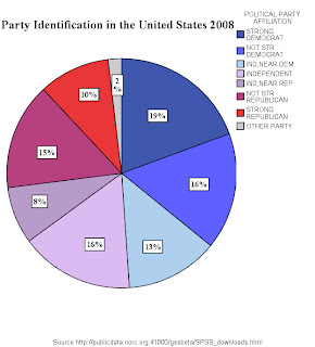 But that is not all we can do. In US Presidential politics other party ID is not relevant so lets eliminate that. Go Properties then Categories then click on Other Parties and press the red cross button then apply.
Now Obama's victory was in many people's view won amongst the independents so we can highlight them by exploding a slice. First select independents on the legend, then Elements then explode slice. Don't select the whole pie as all the slices will be exploded if you do this.

An alternative explanation could be that the democratic base was more fired up after 8 years in opposition. Perhaps this was reflected in the Obama campaign's focus on community organisation which would have benefited most from having a large number of highly committed activists taking the Democrat message right to peoples front doors. So in the next version we look only at the proportions of strong party identifiers. This is again done with the categories tab. Next to which is the depth and angle tab. The effect is 3D. The angle is adjusted. I thought having the bigger Democratic slice first would be better so the order of slice was set to counterclockwise and finally distance was set to 1.
 So there we have it a clear visual which shows that by 2008 the Democratic base was considerably larger than its Republican equivalent. Another startling success of the Presidency of George W. Bush.
Labels:
Chart Editor,
General Social Survey,
Graphs,
SPSS
Wednesday, 3 February 2010
First Post
The prime purpose of this blog is to get me to extend my SPSS skills and be able to demonstrate this to a wider public. I'm sure a wider public can't wait to see me scripting things on SPSS ... wait hello... COME BACK! Seriously this is going to be cool.
I'll also be looking at survey methods and reseach design as part of the MSc in Social Research Methods i'm doing. As a political junkie on the side I might stray onto the methodology of opinion polling. I also like pretty graphs. Pretty graphs can help change the world.
I'll also be looking at survey methods and reseach design as part of the MSc in Social Research Methods i'm doing. As a political junkie on the side I might stray onto the methodology of opinion polling. I also like pretty graphs. Pretty graphs can help change the world.
Subscribe to:
Comments (Atom)


