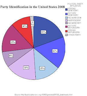
This is data from the 2008 General Social Survey. It shows identification with political parties amongst the US population. As far as pie charts go it does a job but I want to show some of the things the SPSS chart editor can do.
This is selected by double clicking on the object. First I think knowing the actual percentages would be good. This is found under Elements and then click on Show Data Labels. The numbers are a little small and these can be adjusted with the Text Style tab with Preferred Size. Changing the Font to Times New Roman with Bold gives it an extra punch. But there is a problem.
I think the data is too precise. Presenting it to 2 decimal places is over kill and doesn't add to understanding. To adjust this click the Number Format tab and set the number of decimal places to zero and the graph will present whole numbers. Next the colours could be made more representative. Double click on the coloured squares in the legend (the column on the right) to bring up the properties screen and then use the fill and border tab.
This graph really needs a proper title and this can be added with the add title button on the control panel this will bring up the properties panel with which you can adjust to your satisfaction the text but there is another problem the title is covering part of the legend. To fix this double click the title > Text Layout then use the Justify tool. I moved it left.
It's also imprtant to properly source things so we need to add a footnote to do this click on Options > Add Footnote then copy and paste the web address into the box. So as you can see it's starting to look better already.
 But that is not all we can do. In US Presidential politics other party ID is not relevant so lets eliminate that. Go Properties then Categories then click on Other Parties and press the red cross button then apply.
Now Obama's victory was in many people's view won amongst the independents so we can highlight them by exploding a slice. First select independents on the legend, then Elements then explode slice. Don't select the whole pie as all the slices will be exploded if you do this.

An alternative explanation could be that the democratic base was more fired up after 8 years in opposition. Perhaps this was reflected in the Obama campaign's focus on community organisation which would have benefited most from having a large number of highly committed activists taking the Democrat message right to peoples front doors. So in the next version we look only at the proportions of strong party identifiers. This is again done with the categories tab. Next to which is the depth and angle tab. The effect is 3D. The angle is adjusted. I thought having the bigger Democratic slice first would be better so the order of slice was set to counterclockwise and finally distance was set to 1.
 So there we have it a clear visual which shows that by 2008 the Democratic base was considerably larger than its Republican equivalent. Another startling success of the Presidency of George W. Bush.


No comments:
Post a Comment